Content Strategist
Creativity can’t happen in a bubble. It’s our responsibility (and pleasure!) to keep up-to-date with the great work of others as we develop creative solutions for our clients.
Our #design-inspiration Slack channel is a place for our whole team to share anything from gorgeous brands to delightful websites. We also meet once a week for Inspire-Thirty, when we take 30 minutes to expand our worldview by watching anything from Academy Award-winning shorts to design-focused Netflix episodes.
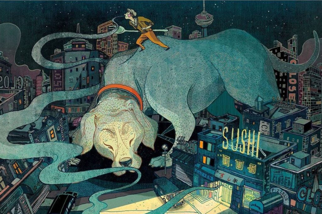
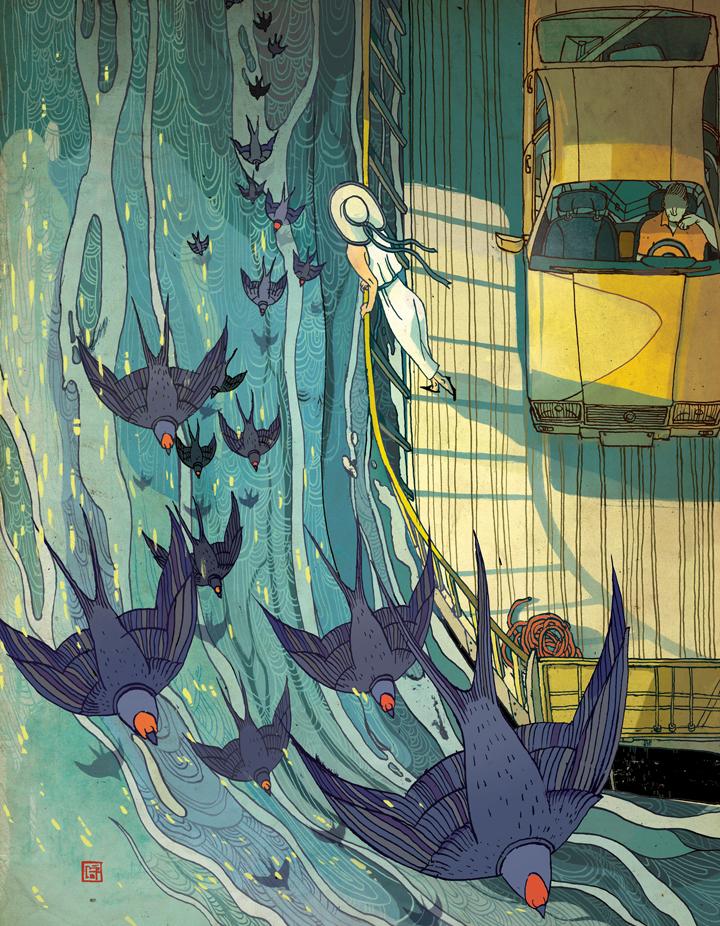
“Victo Ngai is a huge inspiration for me, not only as a designer and illustrator, but also as a storyteller. Her interesting use of colors, line movements and intricate designs always underline a deeper meaning and story behind her illustrations and subjects. It is my dream and goal to become an illustrator who tells stories that touch people’s hearts and open up their imaginations to new possibilities.”
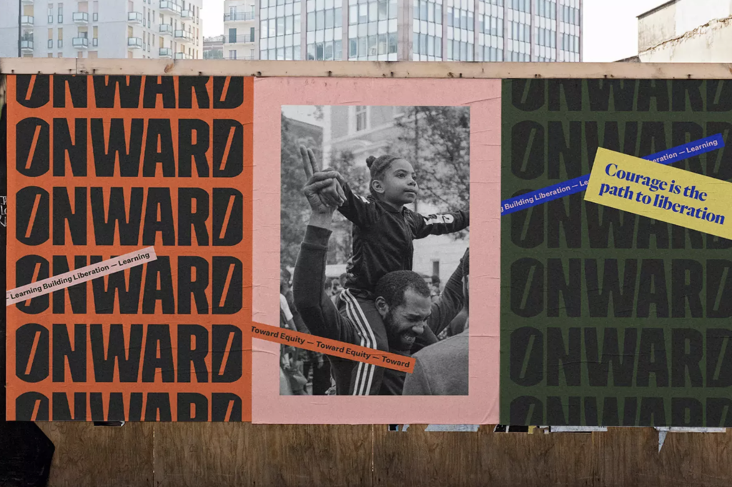
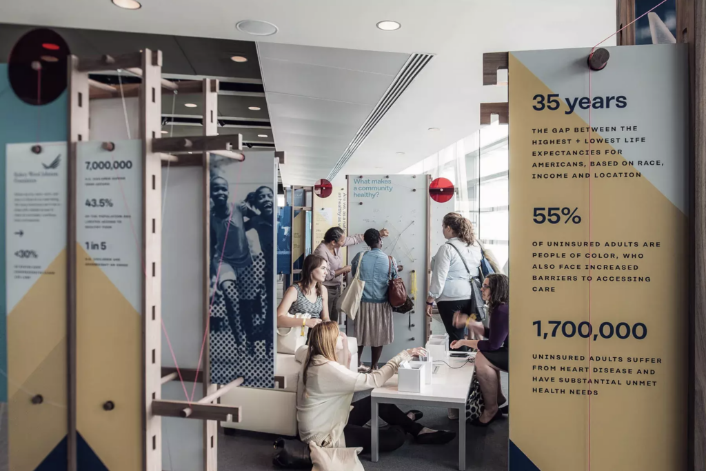
“Firebelly Design is a socially conscious creative studio located in Chicago. The founder, Dawn Hancock, did a TedX Talk years ago that talks about the seeds for starting the design studio and their unique business model of designing for good and giving back to the local community. Beyond this interesting model, I really love their design work. The studio’s website is the right amount of playful without being distracting, professional with a tiny bit of edge. Their work for the Onward brand and the Robert Wood Johnson Foundation are particularly inspiring to me.”
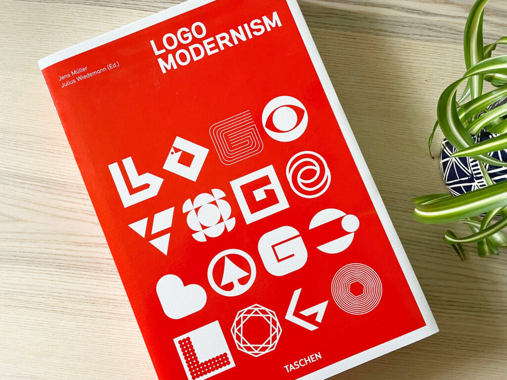
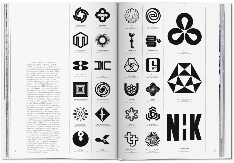
“I was recently gifted the book Logo Modernism by Jens Müller, which brings together 6,000 logo trademarks from the years 1940-1980. The marks are all set in black and white, ranging from corporate identities to abstract symbols and letter forms. Shapes and styles are always being repeated in design, and this is great inspiration for exploring how we use shapes in communications during different time periods. There’s something special and inspiring about flipping through a book to let your mind wander instead of endlessly scrolling online.”
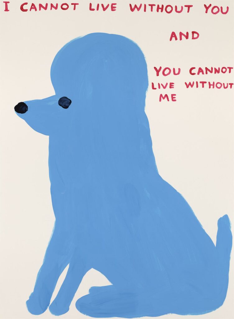
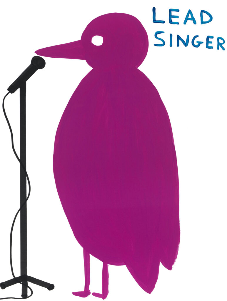
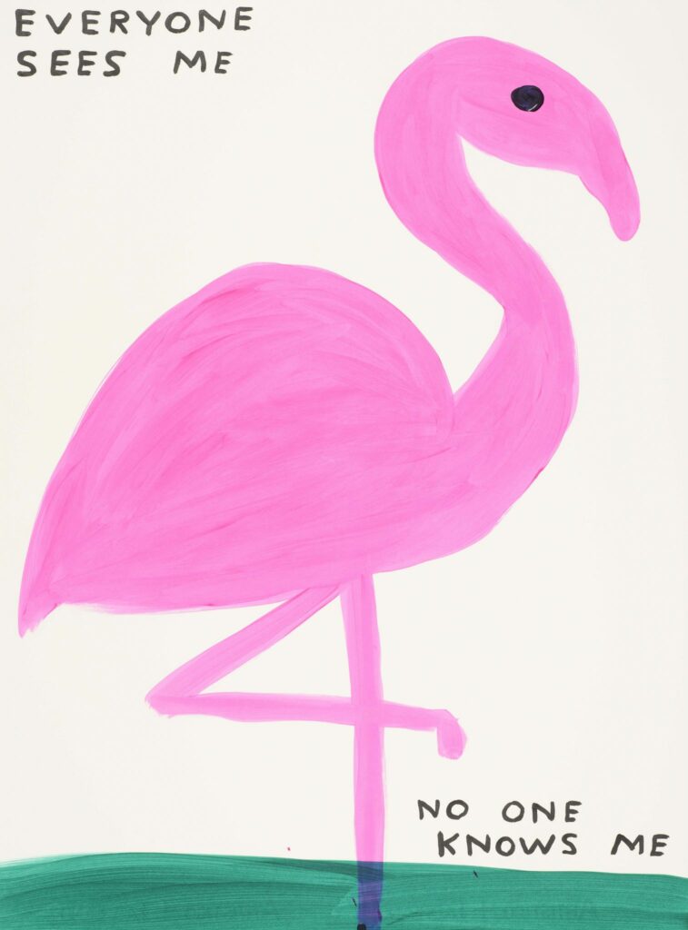
“I love David Shrigley, and in a Louisiana Channel interview from a few years ago, he said something that stuck with me — “I’m trying to make drawings that don’t illustrate text and text that doesn’t describe the image, so there’s a slippage between the two.” I think that’s the mark of great work that involves both visuals and text. If you look at his work and block out the text or block out the visual, it’s just nice, or it doesn’t make any sense. But when both elements are together, there’s this wonderful energy, and you as the viewer get to connect the dots and enjoy what you’ve discovered.”
